The fact that I'm writing this blog post means that I'm still alive, although how I am alive, I don't know, because the journey to self-publish my trilogy Siren Suicides has not only taken away my soul, but my also my sanity, my sleep, the ground from under my feet, the... do I need to continue? What a beast. I did quickly publish Blue Sparrow, the little book of my tweets, but it was nothing, nothing, compared to publishing not 1 novel, but 3! So, as promised to many many people who asked me to share my crazy journey, this is going to be a blog post in 2 parts about everything I learned throughout this process. Why in 2 parts? Because I can't fit it all into one, there is so much stuff! And to borrow from Dante's Inferno, I will use the analogy of the self-publishing steps as 9 circles of Hell. Because. Because they are. Here we go.
WARNING: Before you read any further, know that I only published (almost published) 4 books so far. There are bigger more experienced people out there who know better. Okay, just had to get this off my chest.
Circle 1. Writing. Don't roll your eyes. If we ought to start talking about self-publishing your book, we've got to start from the basics, from the very beginning. And there is nothing to publish if you don't have your writing together. Before you even start thinking about publishing, you've got to get your writing done. And it means, at least 3 drafts. Why? Because even if you're a fucking genius, you're still only human, and every book is written over a long period of time because it takes time to get it out of your system. It's easy to lose sight of the overall story, and multiple drafts exist not just for rewriting and making your sentences pretty, but for streamlining your story. Whatever you didn't see in 1st draft, you will see in the 2nd, whatever you didn't see in the 2nd, you will see in the 3rd. Unless you're an experienced novelist with a bunch of novels under your belt, I don't suggest doing less than 3 drafts. In my case, I did total 6 drafts for Siren Suicides, plus one by my editor, and my 3rd draft for Rosehead will follow my editor's draft. For now, from what I learned, here is how writing works: 1st draft is for spilling the story on paper in its entirety, writing it as fast as you can, in 6 to 8 weeks, if possible. 2nd draft is about slowing down and hacking away all those things that don't fit the story, straightening it, so it starts taking shape. And 3rd draft is for polishing, for adding embellishments where needed and really making it into something you would be proud to show your friends. If you want to read more, I have a ton of blog posts on writing here.
Takeaway: unless you're an experienced writer, do not self-publish your story if it hasn't been through at least 3 drafts.
Circle 2. Editing. All right. Let's say, you have completed your 3rd draft and you feel it's ready. Now what? Now you need an editor. Please, hear me out. I understand that a professional editor can be expensive, anywhere from $500 to $2,000 per book and higher, not mentioning different types of editors, line editors, copy editors, structural editors, true proofreaders, etc. It can be all very confusing and scary. For the sake of this blog post we will keep things very simple. Just imagine an editor as ONE EDITOR. It could be a professional editor, if you can afford one, or just a writer friend who is willing to spend her or his time on helping you make your book better. In my case, I befriended Colleen M. Albert on Twitter (I don't think either of us can remember how) and she picked me as a pro bono project of the year, so I got lucky, because she is awesome. But, regardless of whether or not you get lucky, you simply need another pair of writerly eyes, that's all. You have been looking at your book for so long, you don't see your own issues anymore, and you wouldn't believe how horrible it is to read a self-published book that is full of mistakes. It's nearly impossible to enjoy it. I would suggest you check out a start-up a friend of mine cofounded, called Writer.ly. Type in EDITOR in search window, and voila! Start talking to people. If you have no money, do trade, do anything, to get your book professionally edited. If you want to read more, I have a few blog posts on editing here.
Takeaway: do not self-publish your book unless a professional editor has worked on it. Period.
Circle 3. Formatting. Oh, this is a good one. This is something some self-publishing folks don't think about, and then manage to produce ugly books with margins that are too narrow, fonts that are unreadable, chapter headings that are jumping all over the place, illustrations that are pixilated, etc. Formatting is all about making your book professional grade. Basically, think about this. If you are buying a car, you want to make sure that not only its engine is working, but also its seats are comfortable, its turn signals blink properly, its windows roll down, its exterior paint is not chipped. In other words, you are looking for functionality. Everything in the car has a function, even the exterior paint is first and foremost for corrosion prevention, not just to make the car look pretty. It's like in nature, the most colorful fish uses its every single color for some survival purpose. It's the basic principle of all good design. So, same with your book. Despite the fact that we pick out books for their covers, first and foremost the cover bears a specific function, as in, binding the book. The text on the pages is positioned a specific way to make it readable. The contents are there to let us navigate between chapters, and so on. Your book needs to be professionally formatted, and you either have to pay someone or learn how to do it yourself. The elements will be covered in the next circle of Hell. I have been fortunate enough to stumble on Crenel Publishing on Google+, and have used Stuart's services for all my books so far, and he is amazing. I have also heard great things about Guido Henkel. Both sites have prices on how much it costs.
Takeaway: do not self-publish unless you had your book professionally formatted or learned how to do it yourself.
Circle 4. Book design. Just so we are clear, this is separate from cover design, which is the next circle of Hell. And it's also separate from formatting a book because formatting is a technical task according to book design, where as book design involves design decisions. Dear professional industry people, please correct me if I'm using this term wrong, but what I mean by it is the decisions that go into how the overall book looks, without specifically focusing on the cover, because it's its own beast. So, the elements are:
- Fonts. This is probably one of the most important things, because this is what a book is, little squiggles on a page. I have written a blog post before on picking out fonts for your book, you can refer to it here.
- Illustrations. Are you going to put illustrations in your book? In the middle of the chapter, at the beginning of the chapter? Can you afford an artist, can you draw it yourself, do you want stock illustrations? These are all questions for you to ponder. My daughter has illustrated my books, and we were both inspired by illustrations in Harry Potter books.
- Layout. Okay, I'm skipping the industry jargon here (front matter, etc) in favor of one big category. This simply means deciding where you want to position you chapter headings, page numbers, contents, epigraph, dedication, copyright information, ISBN, etc. You will have to think about little things like, do you want your page numbers to be in the middle, or in the corners? Do you want your contents be centered or left-justified, and do you want page numbers to the right or underneath? A simple solution to this is to pick a book you like and borrow design decisions from there.
These are 3 major categories. Depending on who you work with, different people will call these things differently, and have more or less categories, but the idea will stay the same. How do you want your book to look like? I hope one day I will be able to work with Chip Kidd. Check out his work, pick up his books in book stores to see if you like any, and borrow formatting decisions from there. I happen to have studied design and architecture, so I made most book design decisions myself, but I did base them on how Harry Potter books were laid out, because I love them. So you can do the same. If you want to read more, check out this site called The Book Designer.
Takeaway: look at a lot of well designed books and borrow design decisions from there, if you can't afford a professional book designer, or, hire a professional book designer, if possible.
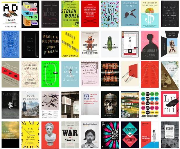
Circle 5. Book cover. Here we go. The scariest and perhaps the most important element of them all, because, whether we want to admit this or not, this is how unknown books sell. People like a cover, people make an emotional decision and buy the book. It does not guarantee that they will read it, but they bought it, and that's what counts. There are designers, illustrators and artists who focus solely on creating book covers. My covers were designed by my daughter Anna Milioutina from my concepts, which were no more than doodles on sticky notes. She is a graphic design student, and we have both learned a lot from the process. But I would say to you, hire a professional, if you can. Damoza is one site that has been recommended to me, and a bunch of my writer friends used him and loved him. Prices are on his site. If you can't afford a professional cover designer, than go for a very simple cover that you can do yourself, either of one simple color and big fonts, or a beautiful clean image from iStockphoto that is mostly uniform in color, so as not to present a lot of problems when you position your title and name in CreateSpace book cover designer (later about this in another circle of Hell). Why? Because less is more, simple is more beautiful, and less pretentious is what stands out best. Here are examples of very simple covers I created for my short stories. Steal my design, or, again, pick up a book you really like and use similar choices for font size and position. Look at these book covers for inspiration.
Takeaway: less is more; either hire a professional book cover designer, or go for very simple, don't use any of those templates you see on CreateSpace, use the one where you can upload your own image (more on this later).
So, here are your first 5 circles of Hell of self-publishing, and I have barely scratched the surface. Please, please, please, correct me if I was wrong and ask questions in comments, I will every single one. Part 2 of this blog will come out on Wednesday morning (by then Siren Suicides should be published!), and it will cover: Circle 6. Printing (through CreateSpace, LuLu, etc.); Circle 7. Digital Distribution (I will include a whole list of sites where to post your book, in addition to Amazon); Circle 8. Bookstores Distribution (I don't know much about this yet, but I'll share few things I know); Circle 9. Marketing (I'll share tips on how to spread the word about your book).